An evolving system overview
Between 2012 and 2016 I was in a team building software, as a service, that was made up of a lot of separate interconnected components (services, if you will). While we documented each component independently we also maintained a system overview which we named “Architecture Overview (Past, Present & Future)”. This was a high level diagram of the system illustrating all its components and whether they talked to each other in a synchronous or asynchronous fashion.
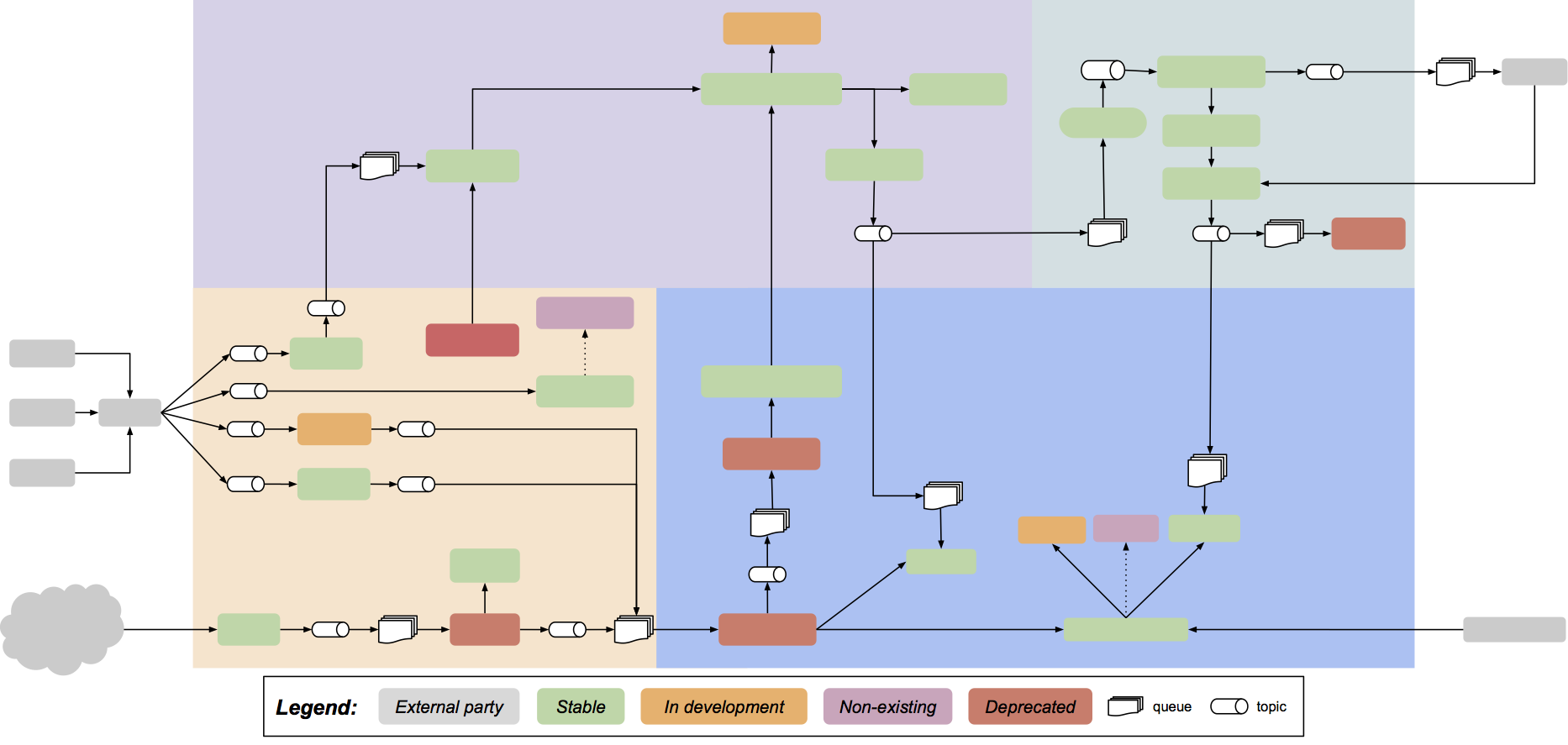
A grey box is an outside system not owned or maintained by the team. All the other small boxes are components. Those that are connected a single arrow communicate synchronously those that are connected via a small “pipe” (topic) and a “stack of documents” (queue) communicate asynchronously. The big background boxes denotes domains which was also, mostly, the equivalent of a team.
One trivial but key thing about this diagram: it was maintained as a Google Drawing which the whole team edited and everyone in the company could view. By turning on automatic publishing of the diagram we could include it as a self-updating image in Wikis and Markdown documents. Linking those images back to the Google Drawing made for simple view-click-edit workflow if one spotted something wrong.
Visualising evolution
To me, the most interesting part of this diagram is its colours. Green indicates a component that is currently considered stable and in production. Orange denotes a component currently being developed or refactored. Purple ones are conceptual components that we, at the time, were discussing or contemplating about introducing. Red denotes components in the process of being phased out, once their runtime was deprovisioned they where removed from the diagram and their repository archived.
In hindsight my view is that the structure of the system as captured in the diagram allowed the individual developer to easily zoom in and work on an isolated component, “walled off” by unit tests. With little effort (<60 minutes every third week) the team used the drawing to come together and think holistically about the system while, at the same time, maintaining an up-to date overview of the system and, most importantly, its current evolutionary state. The creative chaos of having a distributed team mucking about in the same diagram at the same time was also quite funny, those not actively editing would often spend time pasting animated gifs into the diagram.
Which brings me to my current line of thought.
Generations, revisions and versions
If we view software not as a product but as a service which is continuously changed by individuals making independent asynchronous changes to parts of the service: what then is a version?
The system as a whole can’t make a complete and consistent shift in one atomic operation.
In this team we deployed components continuously and independently from each other. We did several major changes to the underlying infrastructure as well as cross-cutting concerns such as authentication without downtime. I therefore view this system as, at any given time, being made up of a mix of generations, where the then current one usually dominates. So while transitioning from the current generation to the next generation the proportions gradually change until the system, for a period of time, is more or less completely made up of the previous next and the now current generation. The former current, now previous, generation having been phased out and the next, future, generation not having been started. In reality it is my experience that a system is rather in a constant transition between two or more generations.
At any given time, regardless of whether the system is made up of a mix of generations or solely of one generation, the system consists of a number of components each at their own revision and most of them exposing some sort of API, whether synchronous or asynchronous, of a given version.
Current idea
If a system is composed of multiple, somewhat, independent components it has no version but consists at any given time of one or more generations. Any given component is, at any given time, made up of one revision (or in flux between revisions in the case of deployment roll-out, canaries, A/B testing etc) and the components themselves expose a number of APIs that each are of a given version. An API can’t change its version without the revision of the component exposing the API also changing, albeit the actual switch might be a outside toggle rather than a deploy. A revision of a component can change while still exposing the same API version and belonging to the same generation of the system. The system can’t fully transition to a new generation without each component being deployed at least once, thus changing each components revision.
So, the system is composed of one or more generations of components each at their own revision and exposing versioned APIs.
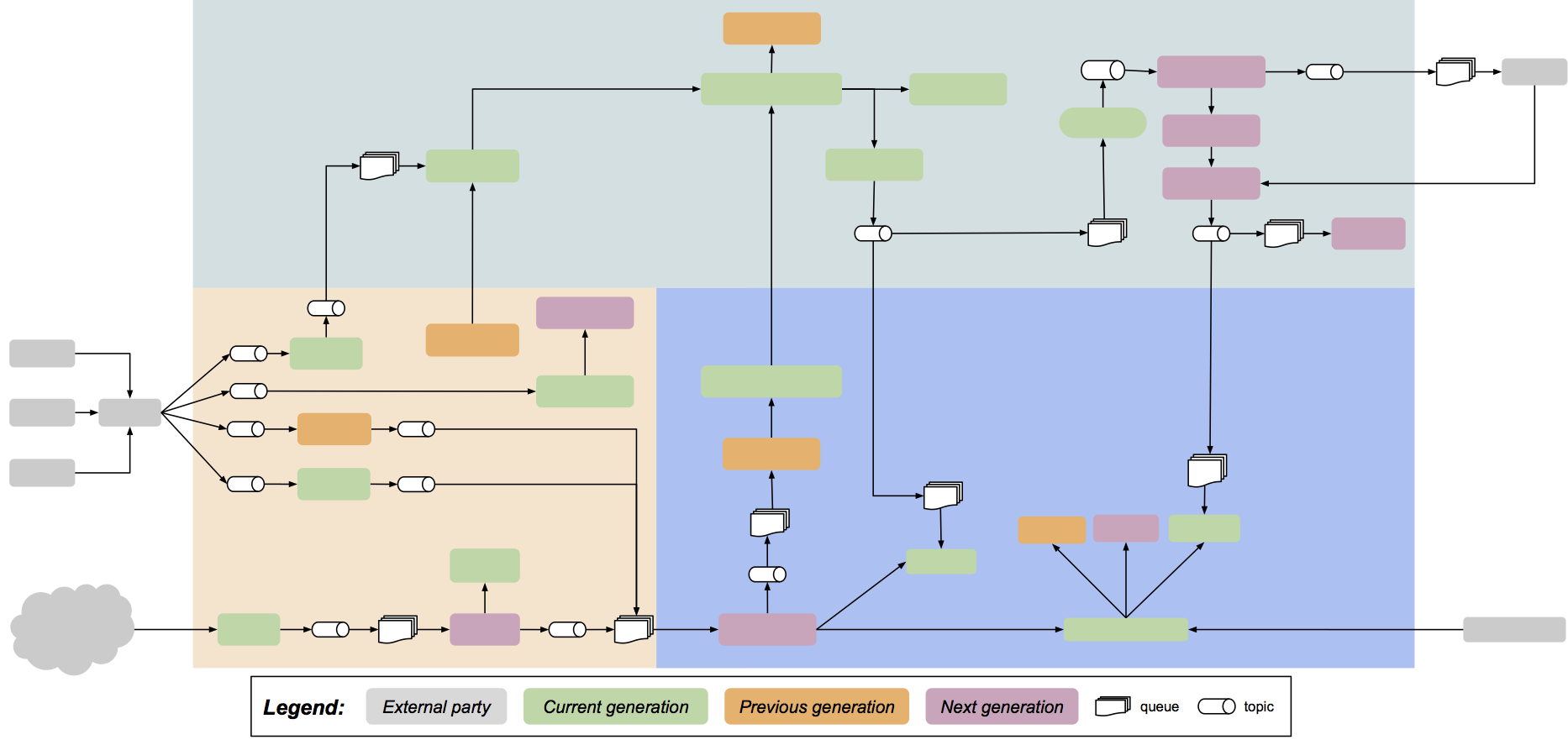
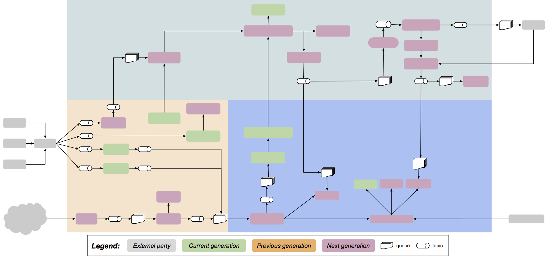
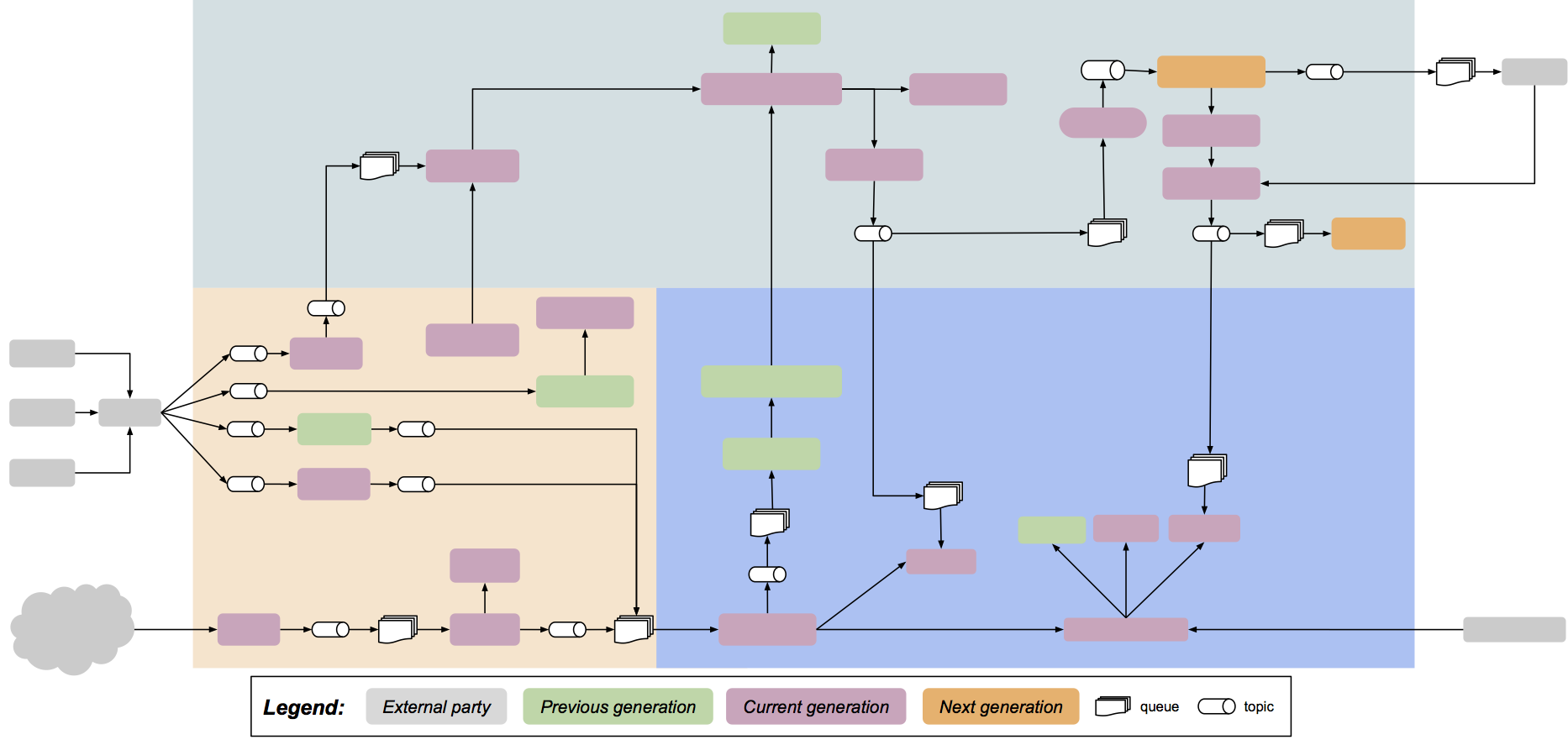
Remapping this to the diagram we used in my previous team I’m wondering if perhaps the colours for components should instead denote generation and perhaps be limited to, for example, three (previous, current and next) depending on what level of complexity the team and system can handle.
Color coding generations
In transition between previous, current and next
Transitioned to current and next
Cycled and transitioning to previous, current and next
 (Note the changed meaning of colours in the legend)